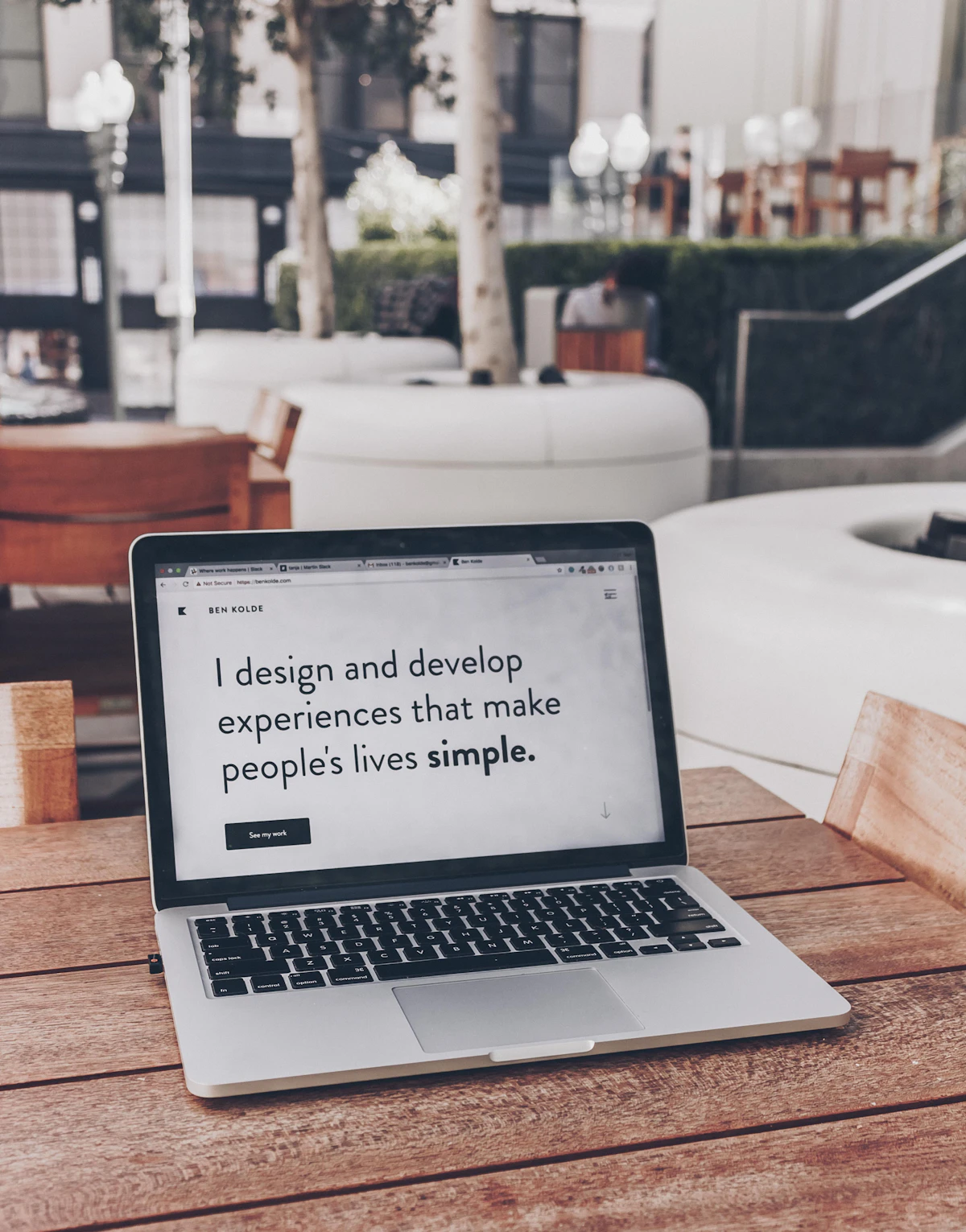
Responsive design is not merely adding media queries after desktop designs are finished. A true mobile-first workflow establishes the baseline experience for 320px screens and progressively enhances upwards to 1920px 4K monitors.
1. The Power of Bootstrap 5 Utility-First Classes
Bootstrap 5 provides flexbox utilities, spacing scales, and responsive breakpoints (d-block d-md-flex justify-content-between align-items-center) that eliminate bulky custom CSS stylesheets.
2. Reusable Blade Components
Encapsulate alert dialogs, blog cards, user avatars, pagination controls, and modal dialogues into lightweight Blade components.